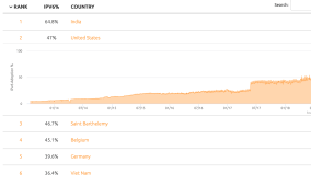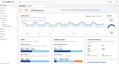
Cloudflare Radar
A hub that showcases global Internet traffic, attack, and technology trends and insights, powered by data from Cloudflare's global network, as well as aggregated and anonymized data from Cloudflare's 1.1.1.1 public DNS Resolver. Updated in near real-time.
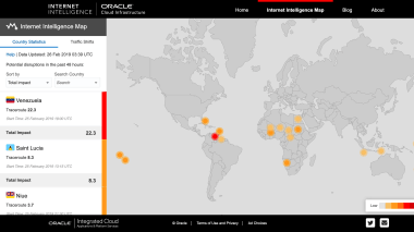
Oracle Internet Intelligence Map
A tool designed to highlight the occurrence of Internet disruptions around the world at country and network levels. Updated in near real-time.
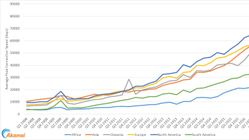
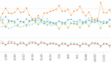
Connection Speed Trends
A tool that enabled users to create and share custom choropleth maps and trending graphs based on Akamai State of the Internet connection speed data. Updated quarterly alongside each new report.
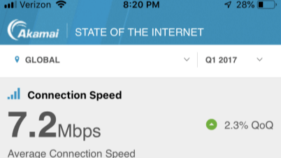
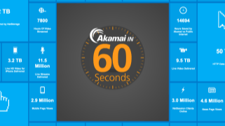
State of the Internet iOS App
A mobile app that enabled users to create and share trending graphs based on Akamai State of the Internet connection speed data, as well as read State of the Internet reports on their mobile devices. Updated quarterly alongside each new report.